Amazing Nasa simulation shows a year's worth of carbon emissions swirling round the world
If your house is under the blood-red patch covering up half the planet then that's probably bad

Sign up for a full digest of all the best opinions of the week in our Voices Dispatches email
Sign up to our free weekly Voices newsletter
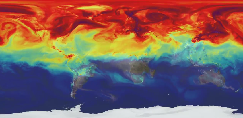
It’s often hard to imagine quite how complex and far-reaching a phenomenon like global warming is, but this visualisation from Nasa does the job, showing continent-size swirls of carbon monoxide and carbon dioxide streaming over nations.
The video models gases from 2006 and Nasa say it will be used in conjunction with the recently-launched Orbiting Carbon Observatory 2 satellite “to better understand both human emissions and natural fluxes”.
The simulation shows the annual cycle of emissions, with the summer months showing a slight dip in C02 levels as plants go into overdrive (around the 1:20s mark) and more carbon monoxide is created by fires in the Southern Hemisphere.
“As summer transitions to fall, and plant photosynthesis decrease, carbon dioxide begins to accumulate in the atmosphere,” says narrator Bill Putman, a Nasa climate scientist at the Goddard Space Flight Center.
“Although this change is expected, we’re seeing higher concentrations of carbon dioxide accumulate in the atmosphere each year. This is contributing to the long-term trend of rising global temperatures.”
What is most compelling about the simulation perhaps is the reminder that when it comes to climate change, yes, it’s the whole world we’re talking about. Those smokey billows aren’t going to just leak away into space: they’re staying with us and things are only going to get hotter.
Subscribe to Independent Premium to bookmark this article
Want to bookmark your favourite articles and stories to read or reference later? Start your Independent Premium subscription today.
Join our commenting forum
Join thought-provoking conversations, follow other Independent readers and see their replies